


The P/E Ratio: Overpaying for a Stock
“Am I paying too much for this stock?”
If you’ve spent any time around investing, you’ve heard of the P/E ratio (Price/Earnings Ratio) — probably the most widely used metric on Wall Street. It looks simple. It isn’t. Here’s what you actually need to know to use it well.
What is the P/E ratio?
The P/E ratio compares a stock’s price to the earnings it generates. If a stock trades at $100 and the company earns $5 per share, the P/E is 20 ($100 ÷ $5).
Think of it like buying a small business. A bakery is for sale for $200,000, and it nets $10,000 a year in profit. You’re paying 20 times annual profit — a P/E of 20. If profits stayed exactly the same, it would take 20 years to earn back your investment.
Two ways to calculate it
You’ll get the same number either way:
Market cap ÷ net income (whole-company view)
Share price ÷ earnings per share (EPS) (the more common, per-share view)
You’ll also see different P/E figures for the same company. That’s normal — they use different time windows. The trailing P/E uses the last 12 months of actual earnings. The forward P/E uses next year’s estimated earnings — useful, but based on forecasts that can be wrong.
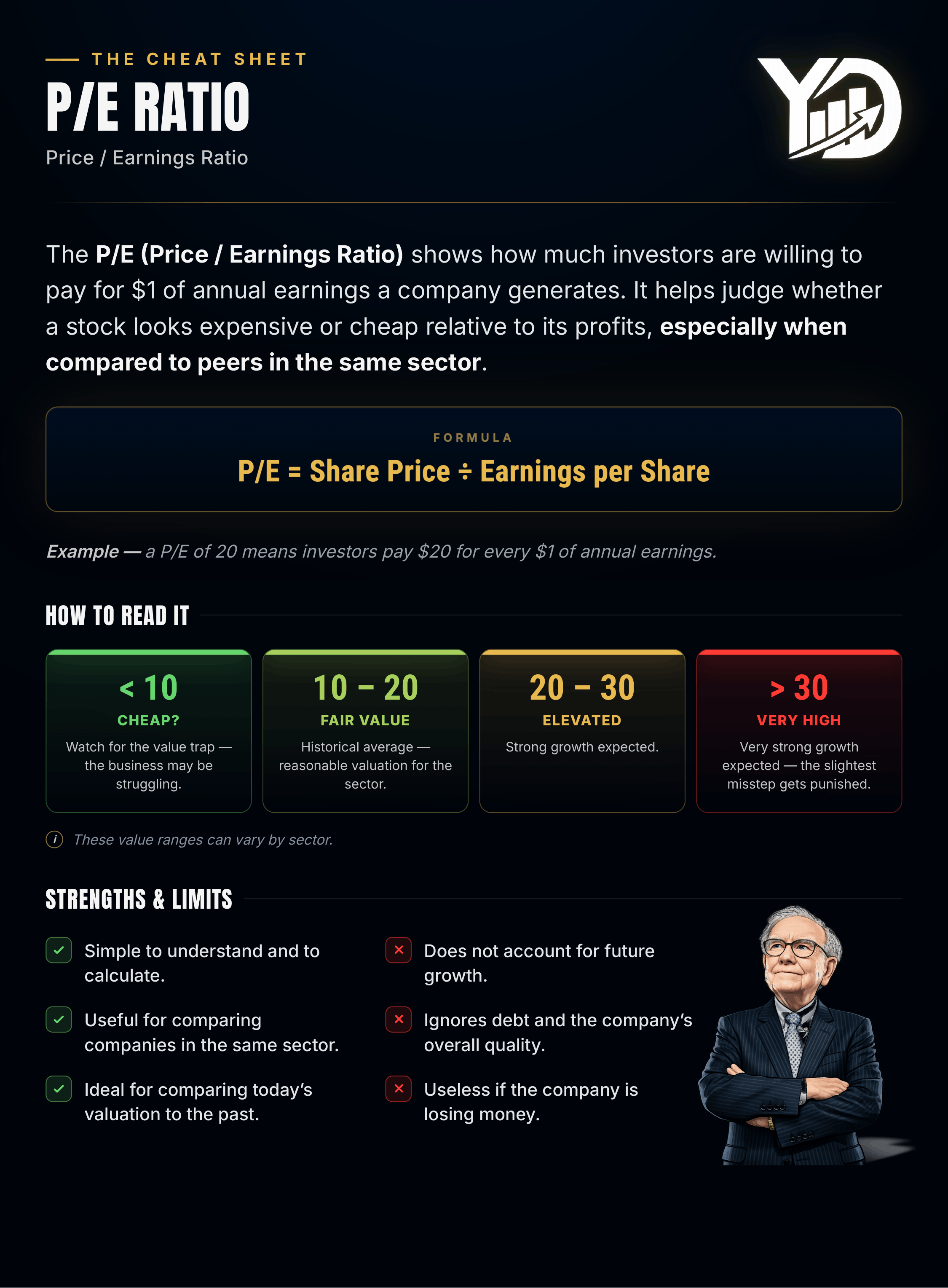
What does a high or low P/E actually mean?
It’s tempting to assume low P/E = cheap, high P/E = expensive. Reality is messier.
📈 A high P/E (30, 40+) usually means investors expect strong future earnings growth. A fast-growing tech company with a P/E of 40 today could see its earnings double next year — dropping its P/E to 20, which no longer looks expensive at all.
📉 A low P/E (8–10) can mean a genuine bargain — or a warning sign that the market expects earnings to fall, due to a struggling business, a declining industry, or company-specific risk.
P/E varies wildly by sector — comparisons only work within one
Comparing a bank’s P/E to a software company’s P/E tells you almost nothing.
Growth sectors (tech, biotech, innovative consumer brands): typically 25–50+. Justified by expected rapid earnings growth.
Mature, cyclical sectors (autos, banks, energy, commodities): typically 8–15. Limited growth, earnings swing with the economic cycle.
Defensive sectors (utilities, telecom, staples): typically 15–20. Slow but steady growth.

Growth matters: enter the PEG ratio
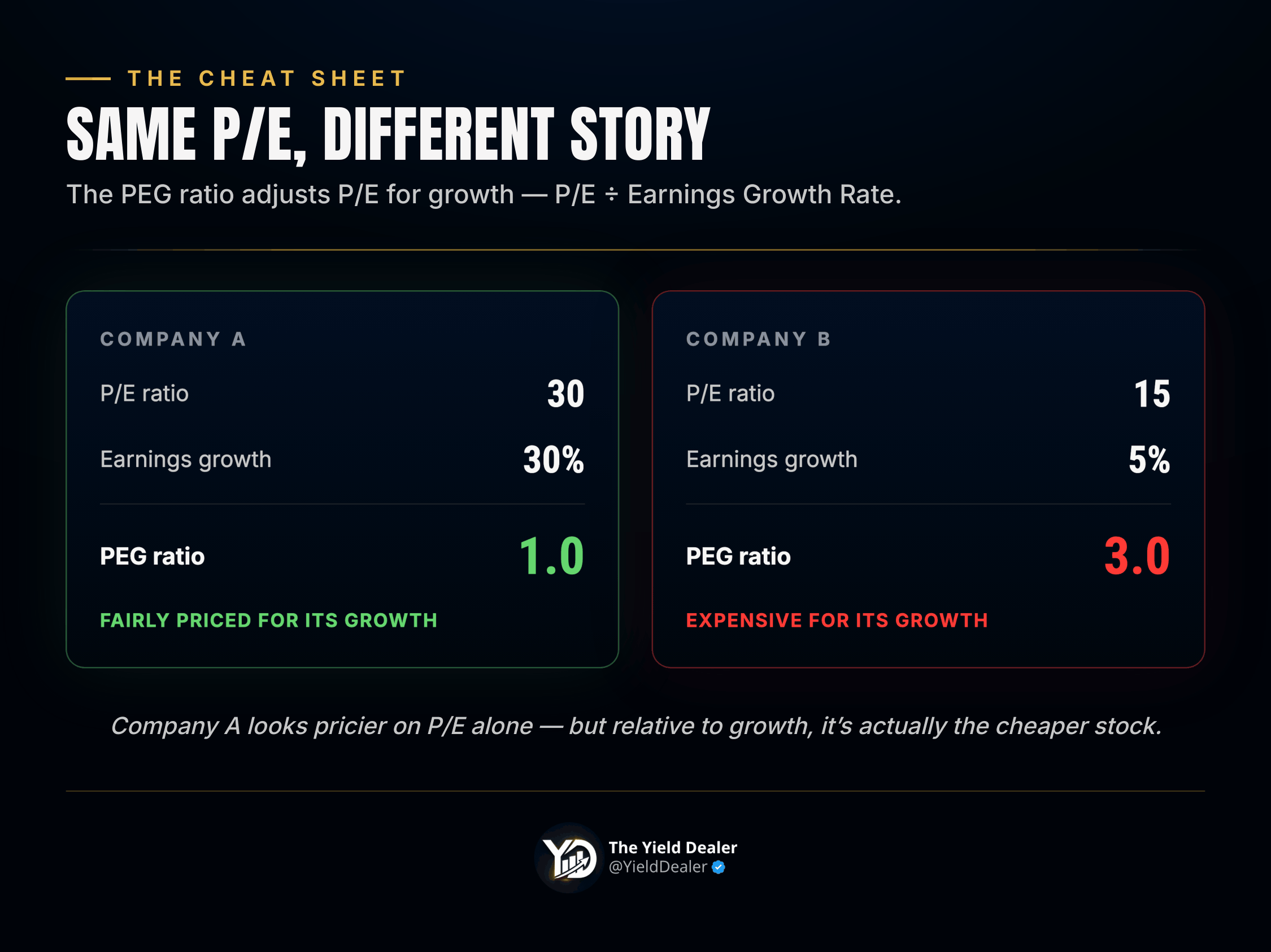
The PEG ratio (P/E ÷ annual earnings growth rate) adjusts P/E for growth.
Company A: P/E of 30, growing earnings 30%/year → PEG = 1. Company B: P/E of 15, growing earnings 5%/year → PEG = 3.
Company A looks pricier on P/E alone, but relative to its growth, it’s actually the cheaper stock. Rule of thumb: PEG below 1 = potentially undervalued; PEG above 2 = potentially overvalued; around 1 = fairly priced for its growth.
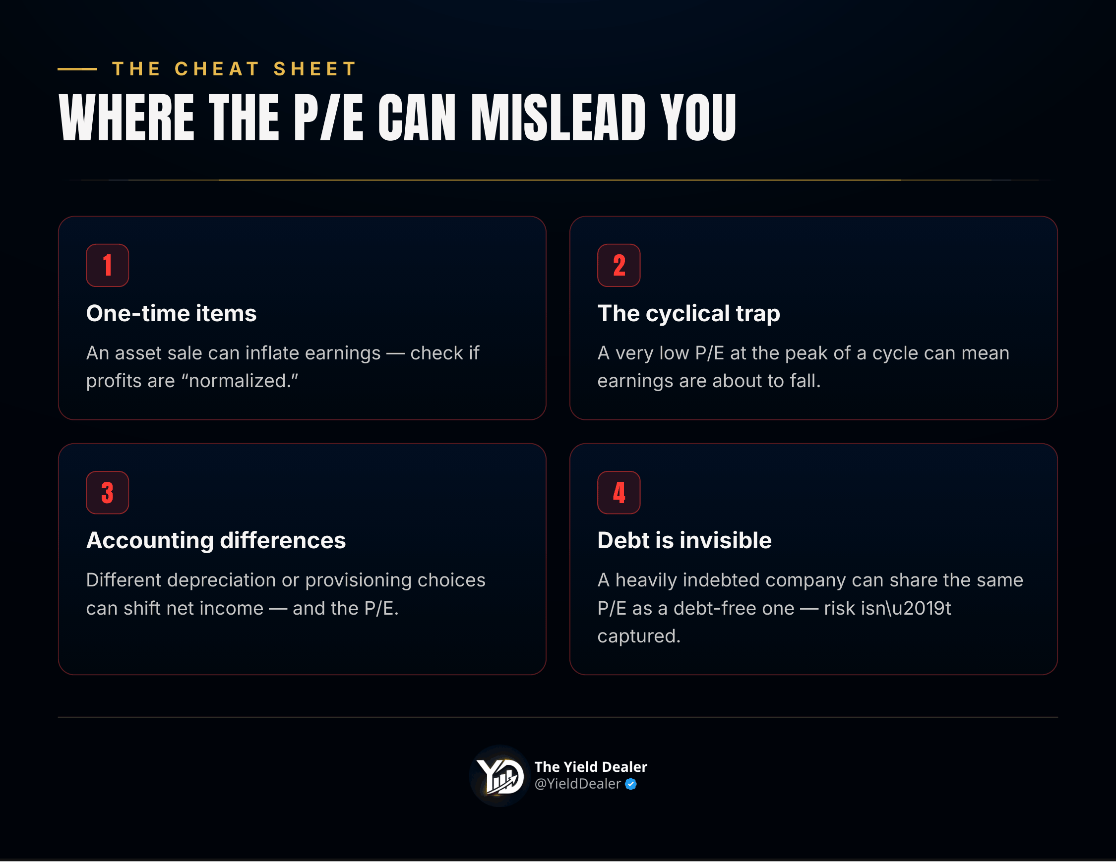
Where the P/E ratio can mislead you
❌ One-time items. A big asset sale can temporarily inflate earnings (and shrink the P/E); one-time charges can do the opposite. Always check if earnings are “normalized” — representative of the recurring business, not a one-off.
❌ Cyclical businesses. An automaker’s P/E can drop to 5–6 at the peak of a boom — earnings are at a high that’s about to reverse. A very low P/E in a cyclical sector can actually mean you’re buying at the top. The reverse is true in a downturn: a high P/E during a recession can be the best entry point, since earnings have nowhere to go but up.
❌ Accounting differences. Two similar companies can report different net income — and different P/Es — simply from different accounting choices (depreciation, reserves, etc.).
❌ Debt and quality aren’t captured at all. A heavily indebted company and a debt-free one can share the same P/E despite very different risk profiles.
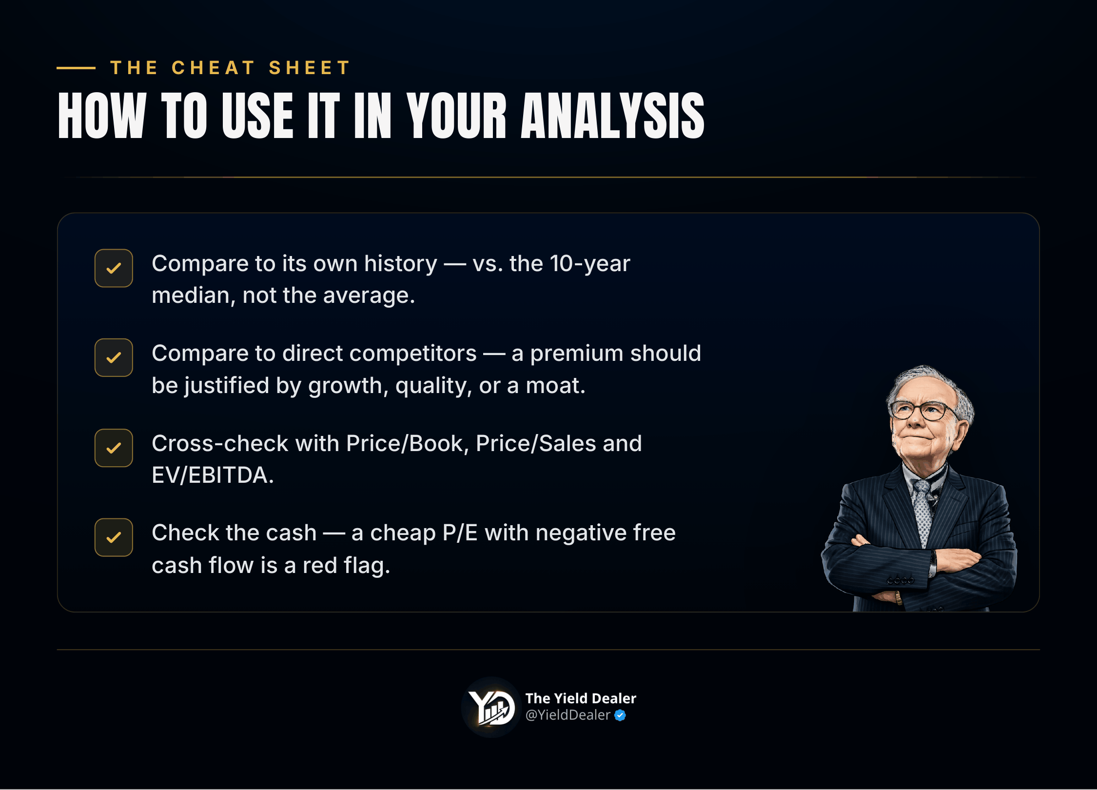
How to actually use the P/E in your analysis
Never use it alone. A structured approach:
Compare to its own history. If a stock usually trades at a P/E of 20 and is now at 12, dig in — is it a real opportunity, or did something change? Comparing to the 10-year median (not the average) tends to be more reliable — a median means the ratio spent half its time above that level and half below.
Compare to direct competitors. If every peer trades at 15x and one trades at 25x, ask why: better growth, better profitability, a durable competitive edge (a “moat”)? Or just overvaluation?
Cross-check with other valuation ratios — Price/Book, Price/Sales, EV/EBITDA — to confirm or challenge what the P/E is telling you.
Check the cash, not just the accounting profit. A company can show attractive earnings while generating little actual cash. If the P/E looks cheap but free cash flow is negative, that’s a red flag.
Variants worth knowing
Normalized P/E — strips out one-time items; usually the most reliable read on true valuation.
Shiller P/E (CAPE) — uses inflation-adjusted earnings averaged over 10 years, developed by Nobel laureate Robert Shiller; useful for valuing the overall market through full economic cycles.
Market-wide P/E — the U.S. market has historically averaged around 15–16x. Above 25–30x, the market is generally considered overvalued; below 10x often signals opportunity — though that usually coincides with a crisis.
Bottom line
The P/E ratio is a fast, powerful first read on whether a stock looks expensive or cheap. But its simplicity hides real complexity: a high P/E isn’t automatically bad if growth backs it up; a low P/E isn’t automatically good if it’s masking real problems.
Use it in context — company history, competitors, sector, and growth outlook. Check whether the earnings behind it are real and recurring. And always pair it with other metrics.
The P/E asks the right question — how much are we paying for this company’s earnings? — but it doesn’t answer it alone. It’s where the analysis starts, not where it ends.


Want to get The Yield Dealer Newsletter in your inbox? Join other readers here.